2D Art
Expressive Self-Portrait Project
"They thought I was a Surrealist, but I wasn't. I never paint dreams or nightmares; I paint my own reality." - Frida Kahlo
"I paint self-portraits because I am so often alone, because I am the person I know best." - Frida Kahlo
"Inspiration is for amateurs; the rest of us just show up and get to work." - Chuck Close
Theory
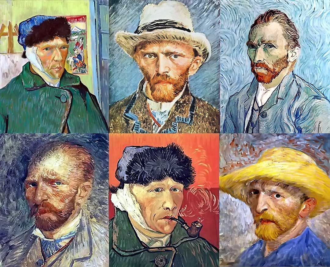
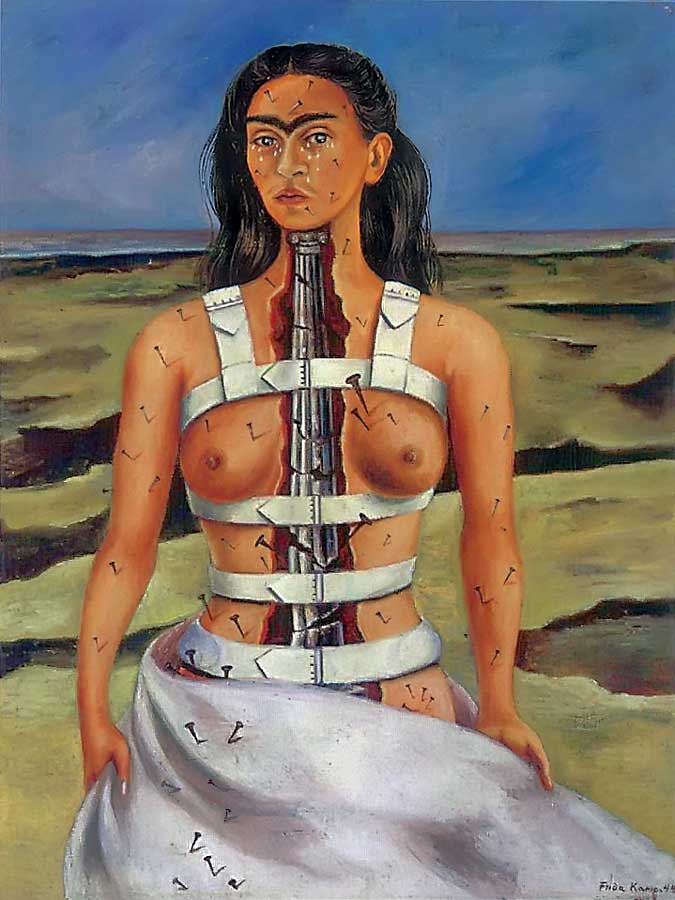
Self Portraits have a long and rich history in the visual arts. Some of the most recognized names - Rembrandt, Frida Kahlo, Vincent van Gogh - are synonymous with this art form. There are several reasons why self-portraiture has enduring appeal for artists:
- Making a portrait of oneself is an excellent option for artists who don't have easy and affordable access to models.
- It's usually easier to draw a portrait of oneself because we are more familiar with our own features than with those of a model.
- The artist can reflect on her inner-most thoughts and emotions, which always helps to create an interesting work of art.
There are several ways to approach the process of making a self-portrait:
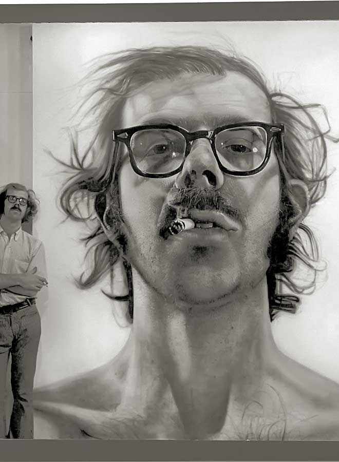
- The artist may depict an accurate likeness of the physical self. This sort of work might be labeled as descriptive, naturalistic or realistic (photo-realism fits into this category). A descriptive self-portrait tries to capture the unique features or appearance of the subject. A strong work will allow the viewer to appreciate the individuality of a person.
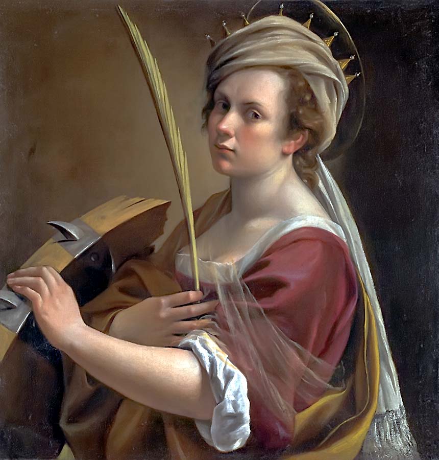
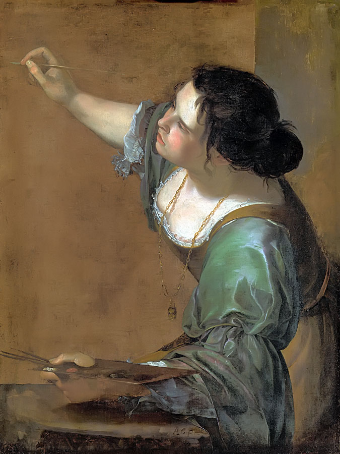
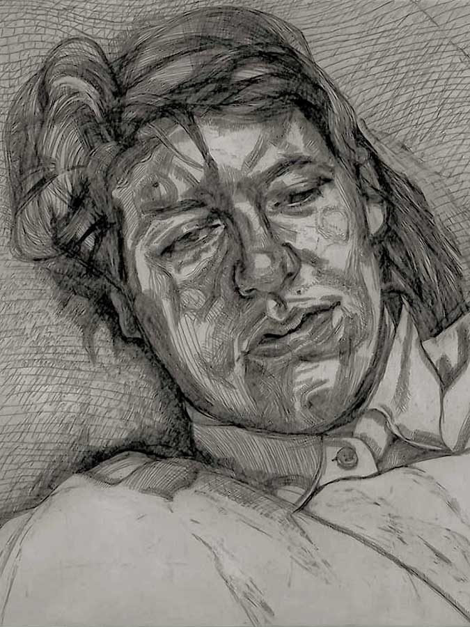
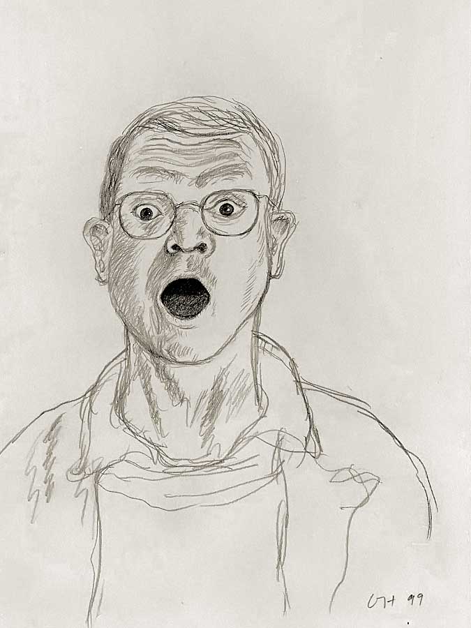
- The artist may depict an exaggerated or candid version of the physical self. A generous definition of the word "exaggeration" allows us to include works that depict an abstracted image of oneself; works that depict oneself as another person (like Artemisia Gentileschi, an artist during the Italian Renaissance, who frequently portrayed herself as historical and mythical figures); works that are physically larger or smaller; works that employ non-traditional materials; and works that emphasize one or more art-elements, such as colour and texture. This type of work might be described as expressive. An expressive self-portrait often reflects the emotional state of the subject. A strong work will resonate with the viewer to create a sense of recognition, empathy or personal connection.
- The artist may combine description and expression in a thousand different ways to create a self-portrait that has both individuality AND emotional resonance.
NOTE: We are using the word, "expressive" in two distinct, but related ways: 1) to describe an emotional state that has corresponding physical identifiers, like a furrowed brow that might indicate annoyance; 2) to describe a type of imagery that has been created to make the viewer feel an emotion (a characteristic feature of Fauvism and Expressionism).
An example of an expressive style of portraiture is, of course, the high-key colour and impasto brushwork of Van Gogh's later paintings.
As an aside: Van Gogh's artworks seem to evoke strong emotions in some viewers, perhaps in part, because he acquired the reputation (after his death) of being a "mad genius" and a "tortured soul". This romanticized view, no doubt, affects how we now perceive his paintings.
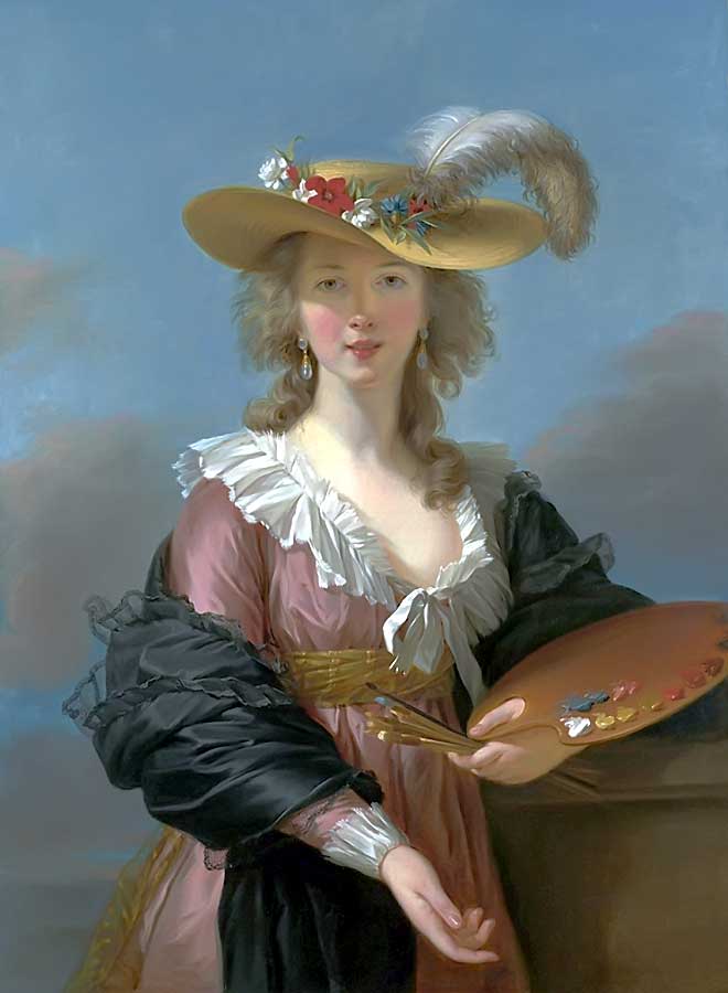
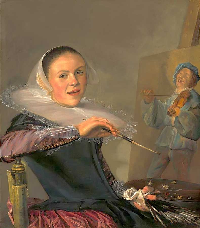
It's also worth noting that much of our understanding and appreciation of historical self-portraits (those from the Renaissance onward) comes from the popularization of a select number of artists (mostly male) who produced competent but extremely conservative self-portraits. In actuality, this genre is vast and includes numerous female artists - Artemisia Gentileschi, Elisabeth Louise Vigee-LeBrun, Clotilde Martin-Pregnard, and many others - whose abilities and creativity easily rivaled (and often surpassed) those of the masters that we now celebrate.
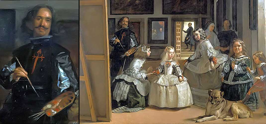
For a wonderful explanation of the image above, Las Meninas by Diego de Silva Velázquez, follow this link to Las Meninas: Is This The Best Painting In History? by The Nerdwriter.
Examples
Description (pre-Modern)
Combined Elements of Description & Expression (pre-Modern)
Combined Elements of Description & Expression (early Modern to post WWII)
Combined Elements of Description & Expression (late Modern to early Post-Modern)
Portrait Tutorial
"Every portrait that is painted with feeling is a portrait of the artist, not of the sitter." - Oscar Wilde
"There are only two styles of portrait painting; the serious and the smirk." - Charles Dickens
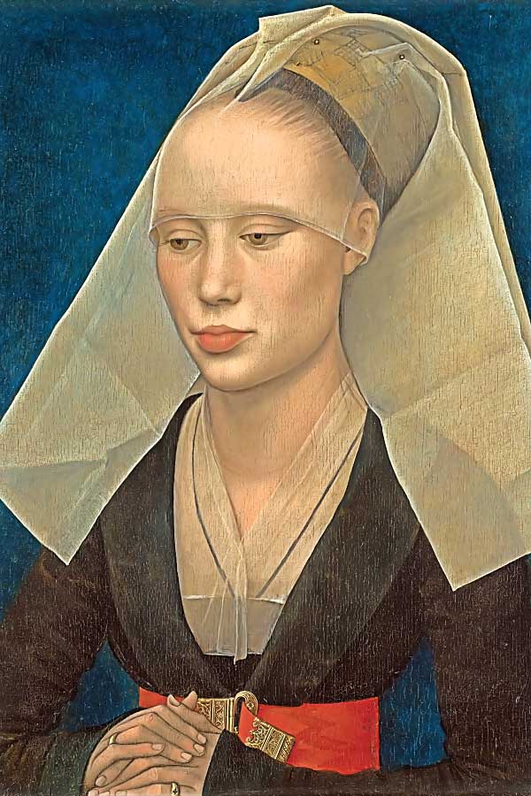
You might know someone who draws stick figures, like the one below. Notice, in this child's drawing, that the eyes are located near the top of the head. The reason that many of us continue, later in life, to place the eyes in the upper half of the face is that we seldom take into account a part of the face that's hidden beneath the hair.
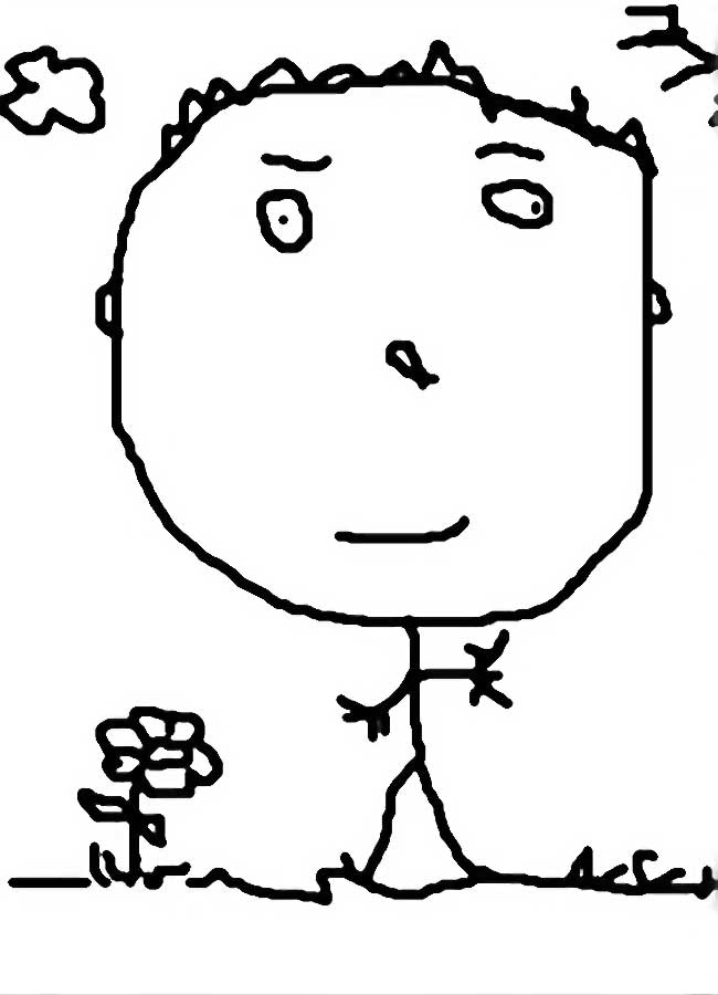
Likewise, the mouth is placed at the bottom of the face with the nose in the exact centre. In a child's drawing, other objects have the same iconographic quality: the sun is usually depicted as a circle with radiating lines to represent rays; clouds always look like puff balls; flowers are simple, daisy-like shapes with a leaf on either side of a gently-curving stem; and so on. In essence, a child draws things the way that she remembers them (with symbolic abstractions) and not the way that they actually exist.
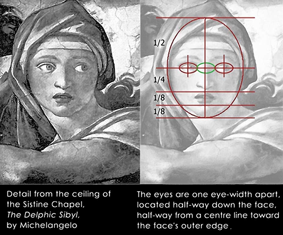
If we now examine a detail of Michelangelo's painting, The Delphic Sibyl (from the Sistine Chapel ceiling), we see a more naturalistic depiction of the human face. If we divide that face horizontally and vertically into four equal quadrants, we can see that the eyes are located in the middle of the face and at a midway point from the centre line to the outer edge of the face. Dividing the lower half of the face further (until we have a quarter and then two-eighths), we can see where the nose, mouth and chin are located. Notice also that the eyes, nose and mouth occupy approximately half of the entire face. There appears to be tremendous structure and symmetry in how the face is constructed.
Follow this step-by-step tutorial to become familiar with the basics of creating a portrait (of yourself or of a model). Vine or willow charcoal are a good choice of materials to start with; more difficult mediums (like pen and ink wash) should be set aside until you're comfortable with the process.
Step 1: First, locate a smallish mirror that you can set in front of you. Get out a piece of good quality, white drawing paper (Fabriano Academia is decent and inexpensive; 15" x 20& is a good size; a larger-sized sketchbook is acceptable). You will also need a 2H or 4H pencil, several sticks of vine or willow charcoal, a gum eraser and a blending stomp.
Begin by observing where the shadows fall and where the highlights are located. Examine the face very carefully, in the same way that you do when preparing to draw a still-life object. Different values will become obvious if you focus a single light source (such as a reading lamp) on the face.
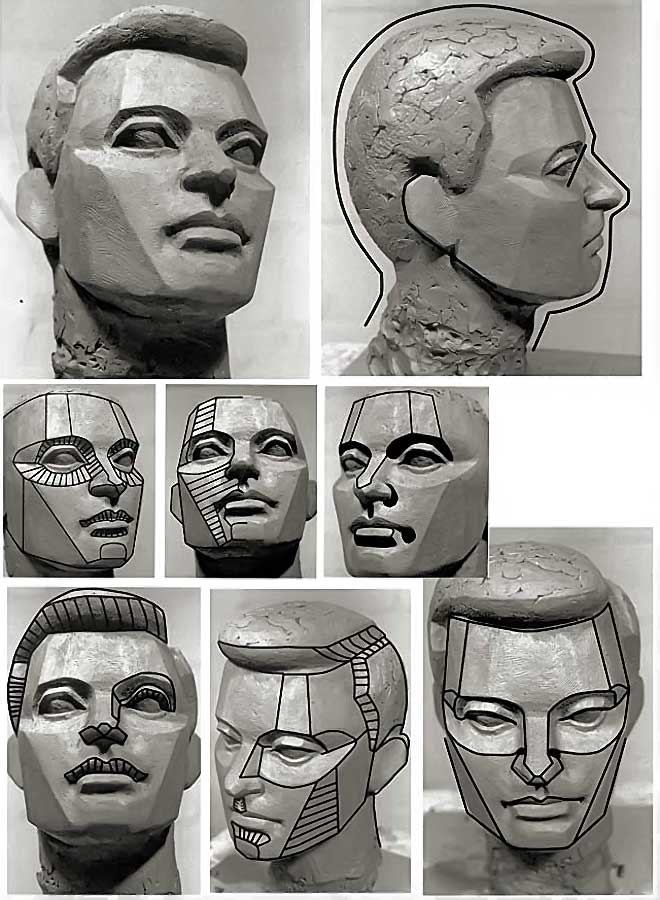
Step 2: Use your pencil to sketch an ellipse with very faint lines and then section it into quarters (as shown above on Michelangelo's work). Dive the lower half into quarters and eighths. Use this construction grid to place the facial features in their proper positions; you will refine the features later. At this early stage, you're not trying to capture a resemblance, but only getting the facial features roughly-positioned so that they occupy the correct amount of space (in relation to each other) and sit where they belong.
Beginning a portrait with a basic construction grid is always a good way to ensure that each feature is proportional to the rest of the face. You can make these proportions even more accurate if you hold your pencil at arm's length and then slide your thumb along it to measure and compare the different parts of the face. It's easier still, if you make a particular feature (the eye, for instance) a standard unit. You can then measure all the other parts of the face against this unit (e.g., width of face = 4.5 eyes; length of nose = 1.5 eyes; width of mouth = 1 eye; and so on).
This measuring technique is also useful whenever you draw figures; the head is then used as a standard unit (e.g., the body = 7 heads high; shoulders = 3 heads wide; hips = 2 heads wide; and so on).
Step 3: After you've roughed in the basic features, you can begin to block in areas of shadow around the facial features with very light pressure on your stick of vine charcoal. If you're using softer materials, such as compressed charcoal, draw extremely lightly at first to prevent your drawing from becoming too dark, too quickly. The darkest areas should be the very last thing that you add to your drawing. To prevent smudges, don't add too much detail to the clothing or the hair until AFTER the face is finished. If you or your model wears glasses, draw that part last.
Step 4: When your shadows are blocked-in, use your blending stomp to create smooth gradations of value from the darker areas into the white of the paper (similar to the technique that I describe in the Mid-Tone Value Project. Remember that because the paper is white, you are in-effect drawing AROUND the highlights. If you are having difficulty in determining how a dark value gradates into a lighter area, use planar value contrast to break the face down into planes (see the image below).
It also helps to ignore, for the moment, the nuances of shadows within shadows. Instead, compare larger blocks of shadow with other blocks of shadow; observing each one in turn, back and forth, to see which one is darker or lighter by comparison. If one of these areas appears darker than it should, a gum eraser will easily remove excess vine charcoal (although, not ink wash; compressed charcoal will lift off, but with some difficulty, depending on how hard you pressed on the material).
Notice, in most of the images in this tutorial, how the nose is given volume by making the area darker on either side of it and beneath the nostrils. Notice also on the forehead, how value gradation is used to blend the shadows on the face into the highlights.
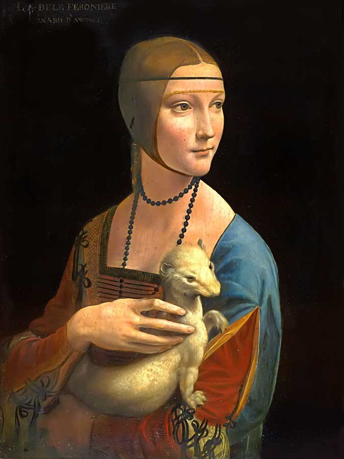
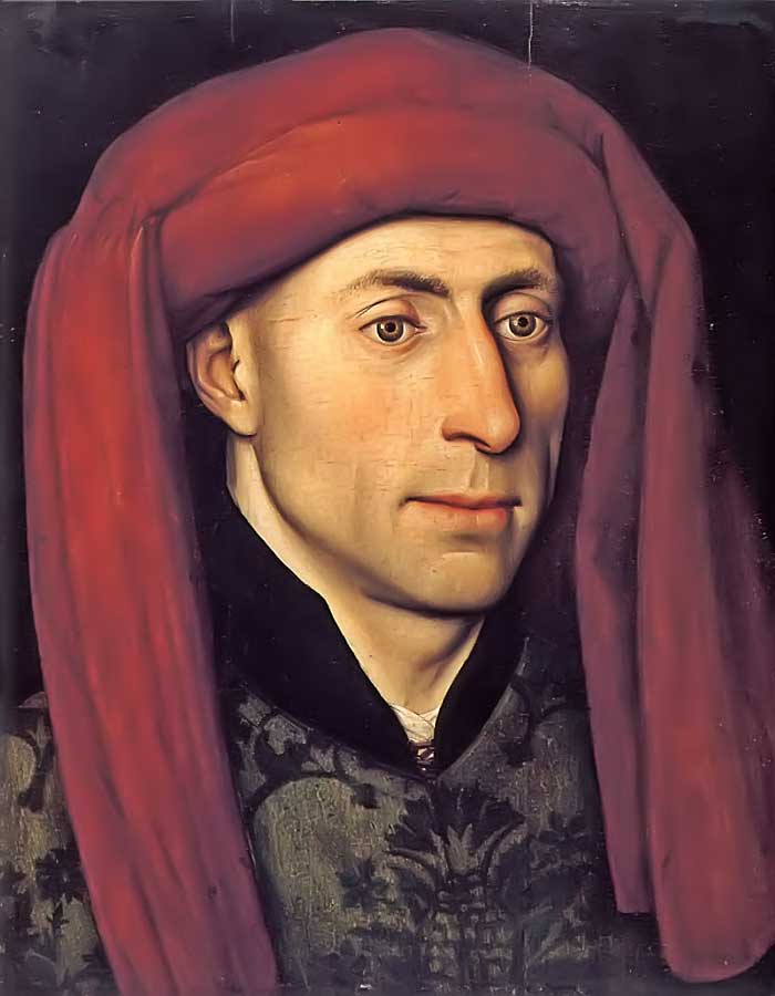
Notice on this image of Leonardo da Vinci's painting, Lady with an Ermine, how the individual features of the face connect to one another: each part of the face blends into the area around it so that there is a seamless continuity of surfaces. The bottom lip, for instance, is merely suggested by the addition of a bit of shadow between the chin and the mouth. The lower lip itself is a slight bit redder, which translates to a half shade darker than the surrounding area in a monochromatic composition. This is generally true for most portraits (especially when a female is depicted), but not always.
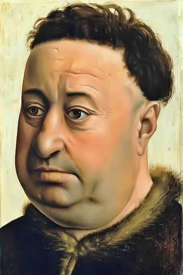
Notice in the next image, Portrait of a Fat Man by Robert Campin, there is no visible difference between the lower lip and the surrounding values and hue. Because the lower part of the mouth appears to be a continuation of the chin, the effect is a very naturalistic appearance, which is an overlooked detail that's easy to miss if you're drawing or painting from memory (i.e., iconographically). Likewise, the nose is a continuation of the cheeks on either side of it.
Step 5: When you've finished the head, shoulders, hair and upper torso, you can tackle the background. Darkening the area behind your subject will add volume to the figure, making the space look more naturalistic. A darker background always seems to push the lighter values forward, thereby creating a deeper and more convincing sense of space beyond the picture plane.
REMEMBER the following points when drawing a portrait:
- The face is usually very symmetrical, with the nose, mouth and eyes situated at arithmetic divisions of 1/2, 1/4 and 1/8 (see again the images at the top of this page).
- In most individuals, proportions can be VERY analogous to each other: the ear (from the top of the helix to the bottom of the lobule) is the same length as the nose (from the nasal root to the nasal tip); the mouth (from corner to corner) is the same size as the distance from one pupil to the other; the width of the nose (at the nostrils) is the same as the width of the eye; and so on.
- Simplify the face by breaking it down into planes (instead of its many concave and convex surfaces).
- Before making any marks, carefully observe all of the details of your model's face (or use a good-quality mirror if you're making a self-portrait).
- Use your drawing materials sparingly at first, only putting down darker values toward the very end of your session.
- Take your time when drawing the eyes because they convey the greatest amount of information about ones personality.
- Don't forget to include a catch light on each eyeball; it's usually a small, hard-edged parallelogram, trapezoid or polygon of bright white value that depicts a reflection from a nearby light source (sometimes, it's the brightest value on a portrait: a detail that seems to breath life into a subject). Follow this link to see a close up example of a catch light on a spherical surface: Mid-Tone Value Project
Finishing your work: To prevent the vine charcoal from smudging, spray a light coat of fixative on your work; Krylon makes a decent product. NOTE: Hair-spray should be avoided because it usually turns yellow over time.
Materials List for this tutorial:
- A hard (2H or 4H) pencil
- A medium-sized blending stomp
- A gum eraser
- Several sticks of vine or willow charcoal (not compressed charcoal, which is a bit too dark and difficult to erase)
- A piece of good quality drawing paper, measuring about 15" x 20"
- A small mirror that you can set in front of you.
To see a step-by-step tutorial on drawing a self portrait with pen & inkwash, go to: Mimetic, Pen & Ink-Wash Project
Examples of Student Work
.jpg)
.jpg)
.jpg)
.jpg)
.jpg)
.jpg)
.jpg)
.jpg)
.jpg)
.jpg)
.jpg)
.jpg)
.jpg)
.jpg)
.jpg)
.jpg)
.jpg)
.jpg)
Project Description
Although it would be a lot of fun to make a colourful self-portrait (like some of the images above), colour adds a level of complexity that's best left for a painting course. For now, we'll focus on making an achromatic self-portrait (no colour; only black, white and numerous shades of grey).
OBJECTIVE: Create an expressive self-portrait of your face, head, neck and shoulders. Your work should be descriptive, but should ALSO express a personal emotion or a state of mind (see the examples below, many of which are exceptionally well-done in their depiction of very subtle emotions, such as contentment, introspection and confusion).
TECHNICAL: While you may choose any materials that you like for your medium and support (keeping in mind that an aqueous medium, such as ink-wash, requires a good quality watercolour paper), it will be advantageous to first create several studies in your sketchbook. Focus on specific features and practice until you achieve a level of confidence with your materials and the process (see the Process Tutorial above).
Further Research
I would recommend this video about art from an excellent PBS series:
- The Case for Realism (Art Assignment, Season 4 Episode 21 | 11m 13s)
Demo
This naturalistic (nearly hyper-realistic) portrait tutorial by Kara Bullock demonstrates the decision-making process that unfolds as an image is worked with charcoal from a blocked-in sketch to a finished drawing:
- 's charcoal drawing tutorial of a Female Portrait