2D Art
Value Project
"Art teaches you the philosophy of life, and if you can't learn it from art, you can't learn it at all. It shows you that there is no perfection. There is light, and there is shadow. Everything is in half tint." - William Morris Hunt
"In art, there is no need for color; I see only light and shade. Give me a crayon, and I will paint your portrait." - Francisco Goya
Theory
There's an almost infinite number of ways that we can depict 3D objects on a 2D surface. Surprisingly, there are only two ways that value relationships can be represented: planar value contrast or value gradation. Planar value contrast is used when depicting values on two or more surfaces that meet abruptly to form an edge or when depicting cast shadows. Value gradation is used when the edge disappears and the transition from one value to another is smoothed out over a convex or concave surface.
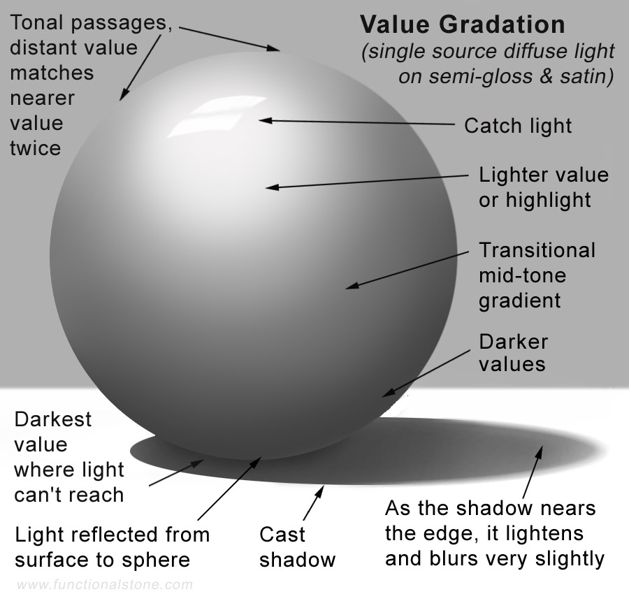
Here's an illustration of a sphere with smooth gradations of value from light to dark. Note the reflected light on the sphere and the transitional gradient toward the edge of the cast shadow. Notice that the darkest value occupies a very small amount of the composition. The daytime illumination of a still-life, where the objects have mostly lighter values, results in a greater amount of highlight and light-to-middle values. On the other hand, if the objects were darker or the scene was illuminated by candlelight and at night, there would be a larger number of dark and middle-to-dark values.
Value Study Tutorial
"The chief concern of the French Impressionists was the discovery of balance between light and dark." - Stephen Gardiner
First, locate several smallish items with different shapes and, if possible, in neutral colours (such as pale grey). Arrange the items on a table in a pleasing manner so that each one displays the greatest number of sides and have a maximum range of values from light to dark. Different values will become obvious if you focus a single light source such as a reading lamp on your still life. Depth of space in the composition can be achieved by overlapping the objects (placing one item slightly in front of another).
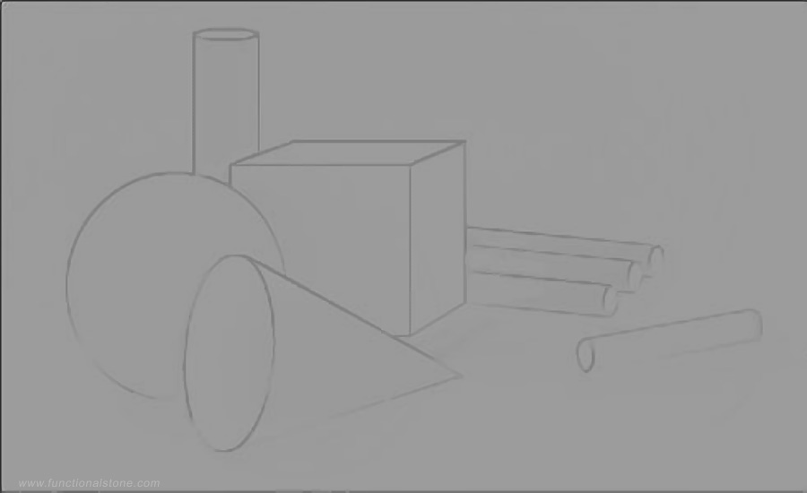
Begin by using a 4H pencil to sketch your composition with very faint lines. Use your white stick of Conté to block in the lightest values on your still life objects. Use a blending stomp (a sharpened cylinder of compressed paper) to blend the Conté into the grey of the paper. Next, use your black stick of Conté to block in the darkest values on your still life objects. Again, use a blending stomp to blend the Conté into the grey of the paper. Notice how the colour of the paper begins to provide the mid-tones in the overall range of values.
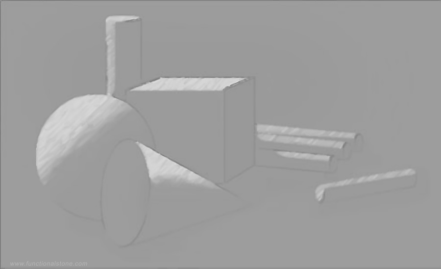
As you work, try to avoid blending the white Conté into the black Conté or vice versa. This mistake is easy to make and would produce a messy-looking mid-tone that doesn't harmonize with the cleaner mid tones produced by the paper. It's OK for the black and white to touch, but they must NEVER be allowed to mix. If you do accidently mix the white with the black and you've spent so much time working on an area that you don't want to erase it, you'll have to produce ALL of your mid-tones that way so that the composition appears unified. The end result will be less than ideal (and it kind of defeats the purpose of the assignment), so try to avoid it.
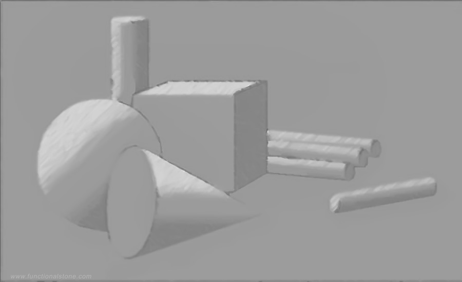
The fourth drawing is nearly finished. The objects have a good sense of volume but do not interact with each other. They also appear to float in an undefined space as though un-tethered to a surface. It's now necessary to darken the area behind some of the objects (the background) so that the space becomes better defined. Small amounts of shadow beneath the objects will give the illusion that they are sitting on a surface. Volume and depth can be emphasized by adding faint shadows where the objects overlap each other.
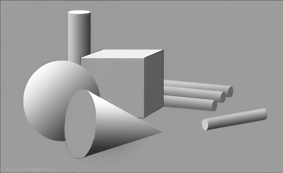
In the last drawing, the composition felt unbalanced, so I added another cylinder at the bottom right to increase the visual weight on that side. I also added a horizontal line through the composition and then darkened the upper portion so that the surface on which the objects sit now resembles a table top. All of the objects have a nice sense of solidity; the shadows on the table-like surface get softer (lighter and slightly blurry) as they move away from the objects; there's a consistent sense of light and shadow in this example wherein light seems to enter the scene from only one direction and falls on every object in the same way.
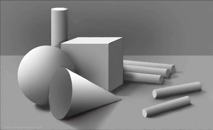
Notice that there's a sense of logic in how the shadows appear to fall: planes that are slightly turned away from the light source are brighter than planes that are turned completely away from the source of light. Between these two extremes, all of the degrees (of planes turning from the light) are proportinally illuminated. Likewise, darker shadows are found on surfaces within recesses (inside the cone) or obscured by other objects (the cube's shadow on the cylinders).
Overall, the drawing is nicely executed, but it's much too boring in terms of subject matter. A better choice would be to use objects that are unusual, unique or rarely encountered. A successful drawing will engage the viewer on several levels: 1) aesthetically, through competence of execution; 2) emotionally, through choice of subject matter; 3) intellectually, through the metaphorical associations (meaning) that arise when the viewer interprets the subject matter.
Examples of Student Work
.jpg)
.jpg)
.jpg)
.jpg)
.jpg)
.jpg)
.jpg)
.jpg)
.jpg)
.jpg)
.jpg)
.jpg)
.jpg)
.jpg)
.jpg)
.jpg)
.jpg)
.jpg)
.jpg)
.jpg)
.jpg)
.jpg)
.jpg)
.jpg)
.jpg)
.jpg)
.jpg)
.jpg)
.jpg)
.jpg)
.jpg)
.jpg)
.jpg)
.jpg)
.jpg)
.jpg)
.jpg)
.jpg)
.jpg)
.jpg)
.jpg)
.jpg)
.jpg)
.jpg)
.jpg)
.jpg)
.jpg)
.jpg)
.jpg)
.jpg)
.jpg)
.jpg)
.jpg)
.jpg)
.jpg)
.jpg)
.jpg)
Project Description
OBJECTIVE: On a full sheet of good-quality paper that's middle grey in colour (Canson Mi-Teintes 'Steel Grey' works quite nicely), draw a still-life composition using ONLY black and white sticks of Conté. White Conté will be used to depict lighter values and highlights; black Conté will be used to depict darker values and shadows. The grey of the paper (by itself or with thin, translucent layers of black and white on it, but NOT black and white mixed together) will represent the middle values of your composition.
TECHNICAL: Draw very lightly at first. You should apply more pressure to the Conté stick only when you near completion of an area and, even then, be very sparing with the amount that you use. It' always easier to add a bit more later, if necessary, than to erase an excessive amount of Conté.
A good way to think about this technique is that you will be using your blending stomp as your primary drawing tool; the Conté sticks are NOT drawing tools, but simply a convenient way to deliver your medium to the appropriate places on your paper. Use two separate blending stomps to prevent the white and the black Conté from contaminating each other. If you accidently get them mixed up or your stomps become blunted, use a pencil sharpener or a piece of fine-grit sandpaper to clean and sharpen them.
AESTHETIC: Your drawing should depict a full range of values, from white to black and many shades of grey in between. Your work must also adhere to the Principles of Composition, especially Emphasis, Variety, Balance, Unity and Rhythm.
Further Research
I would recommend these videos:
- How to Shade a Drawing (Proko, 2014 | 12m)
- Top 5 Shading Mistakes (Proko, 2018 | 14m 36s)
- Structure Basics: Making Things Look 3D (Proko, 2013 | 11m 11s)
- Hopper's Nighthawks: Look Through The Window (The Nerdwriter, 2015 | 7m 38s)